Published 2024-09-01
The website you’re looking at (at least at the time of publishing) is the ninth version of my website1. If you’re willing to permit me the indulgence, I’d like to reflect on how this website has got here since it’s first appearance in 2017. (Click here if you don’t wish to permit me the indulgence.)
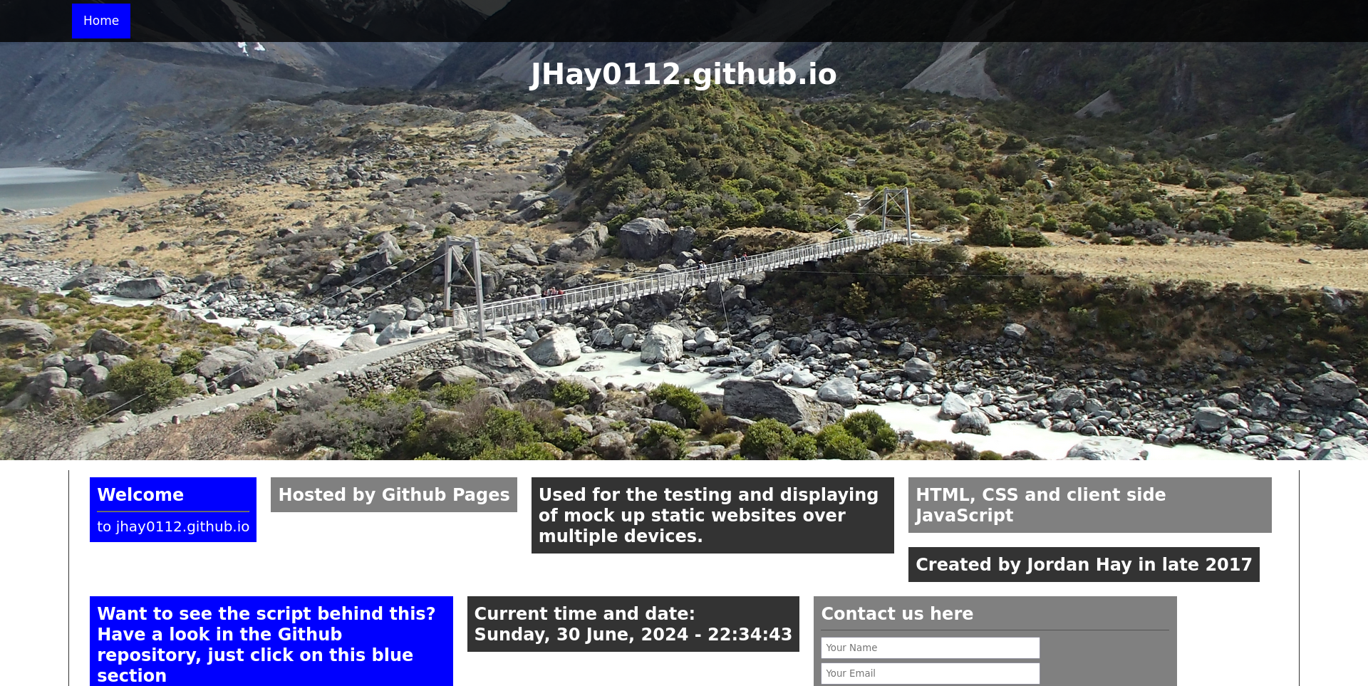
Sadly, this website wasn’t remotely mobile-friendly, and I liked playing with JavaScript perhaps a little bit too much. You might notice the website even tells you the current time and date (why?)
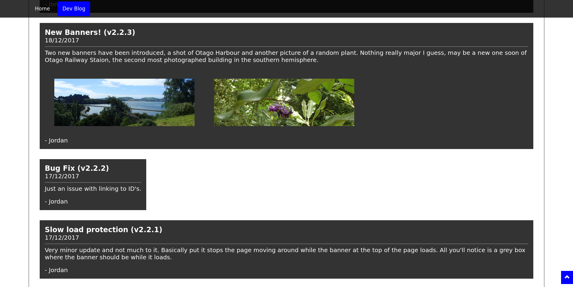
Version 2 didn’t depart from the bold colour scheme. It made some minor improvements and added a development blog. (I recall agonising over whether to call it a blog or a log, in retrospect I would have called it a log.) In fact, the only reason that I now distinguish between this version and version 1 is because that very development blog does.
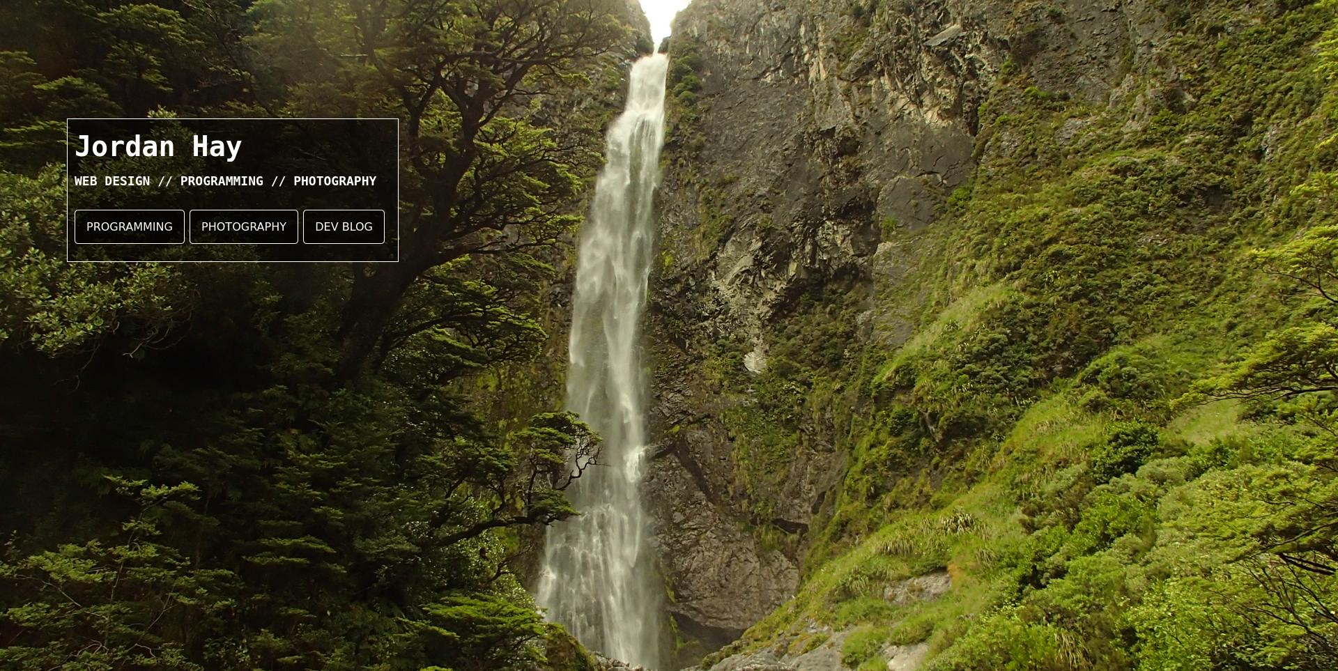
Version 3 refined the design features laid down by versions 1 and 2 with a minimal landing page. I’m less fond of simple landing pages these days2 but there is something that I still quite like about this look.
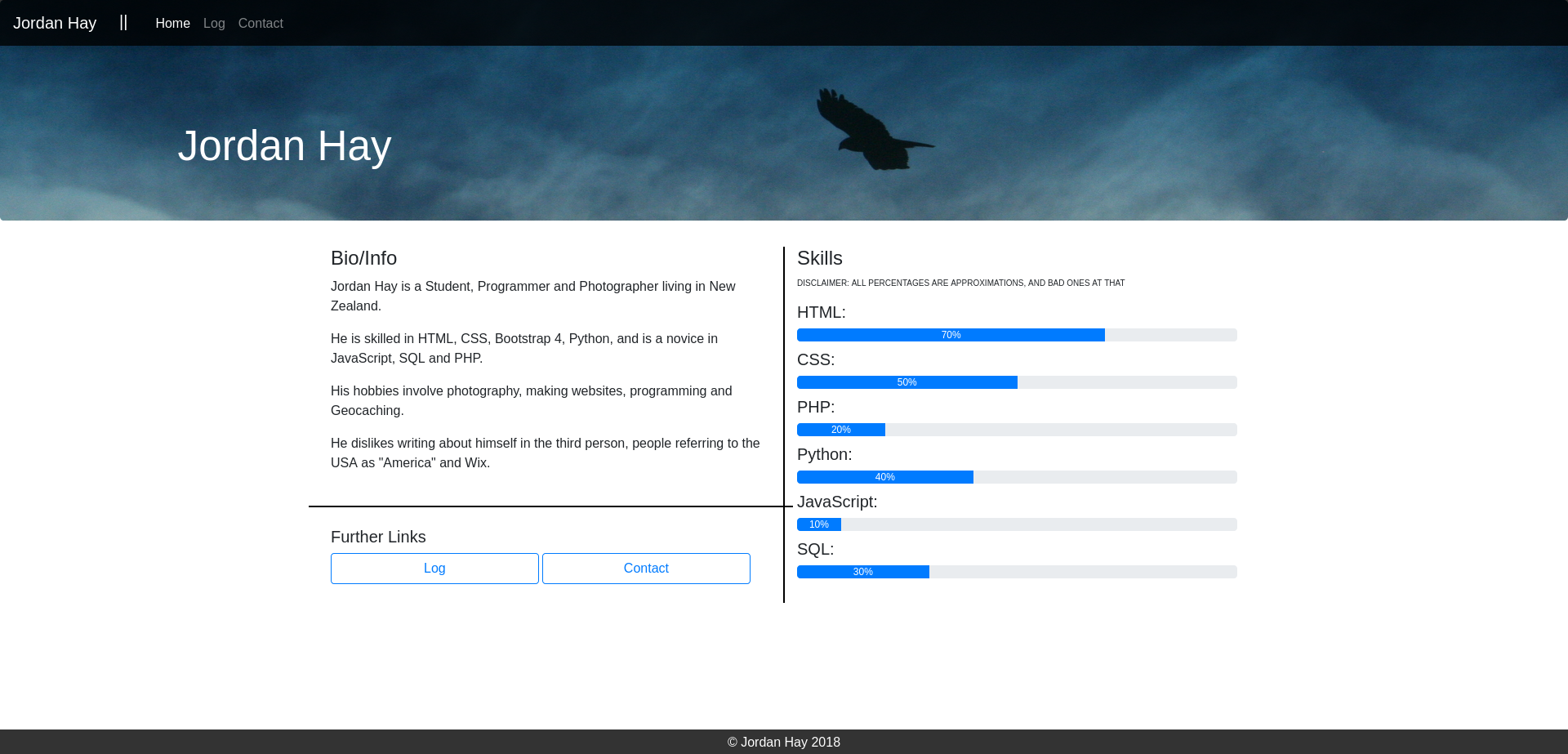
Version 4 simply tweaked the landing page and isn’t terribly interesting so we’ll skip straight to version 5. In Version 5 I added more information to the landing page, I particularly enjoyed the “skill bars” at the time.
Version 5 is notable since I began to use Bootstrap as my first foray into mobile-friendly design (a practice I have now since stopped in favour of my own mobile-friendly CSS.)
I wish I could skip version 6. (Though I like the background!)
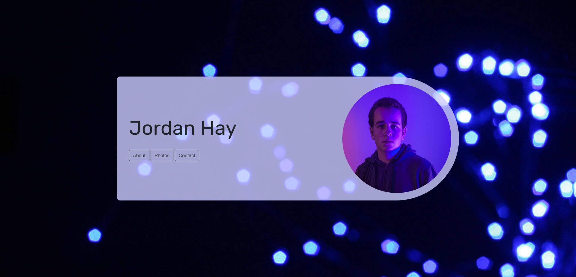
Version 7 followed a very similar theme with a slightly more up-beat feel.
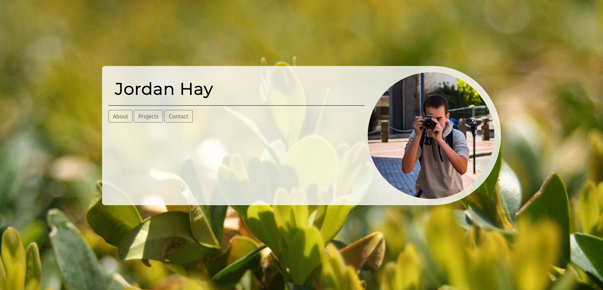
Version 8 was a signifigant overhaul compared to most of the previous versions. I wanted to increase the cohesive feel of the website and use it as a real show piece. This was a level of ambition above everything that came before (except perhaps the first few iterations.)
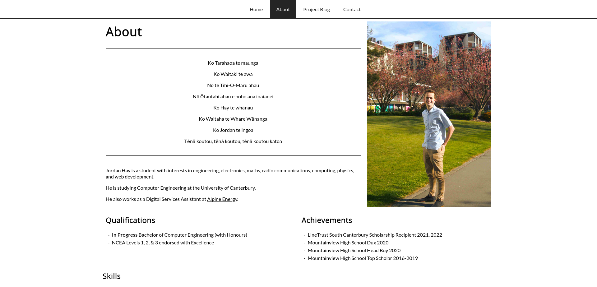
I was particularly proud of version 8, and it hung around for quite a while. However, the novelty of the flashy animations slowly but surely wore off. I stripped back the animations and attempted to move the website to a much more lightweight feel, but I never really felt entirely satisfied with the layout. After much delay I decided something had to give, thus version 9 was born.
Version 9 (the current version at the time of writing) is designed to feel simple, and ideally like little more than a piece of paper with some writing and images on it. Those of you on a desktop computer have large margins on the left and right to keep a paper-like ratio, and the navigation links are static and simply underlined at the top of the page. Only the landing page has a header image, other pages are focused only on their content. I will admit that I have still indulged in a little JavaScript to change the header image on the landing page with each visit, however that is the extent of the dynamic content (unless you happen to press a specific key on the home page…)
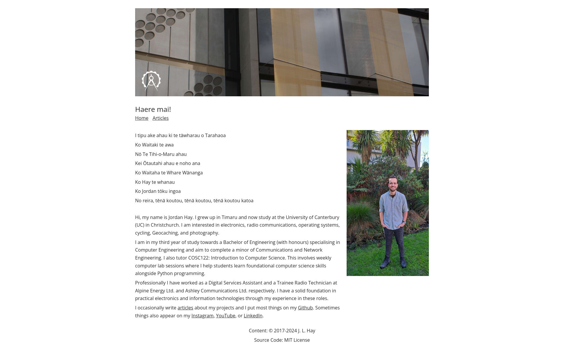
More changes to come no doubt…
-
This does really depend upon how you define versions. For this article’s purposes I’m defining versions as major changes to the style and layout of the website. I haven’t formally defined versions in my version control system and have tended to continuously tweak and refine my website without noting what “version” it is - this isn’t terribly good habit, and I ought to change it. ↩
-
Landing pages require an extra click for the user to find out anything about the website. I prefer the first page to explain itself, and then the user has a better idea of why they might click into subsequent pages. This isn’t a hard and fast rule though! There are always exceptions, and this is just what I think is best for my website in particular. ↩